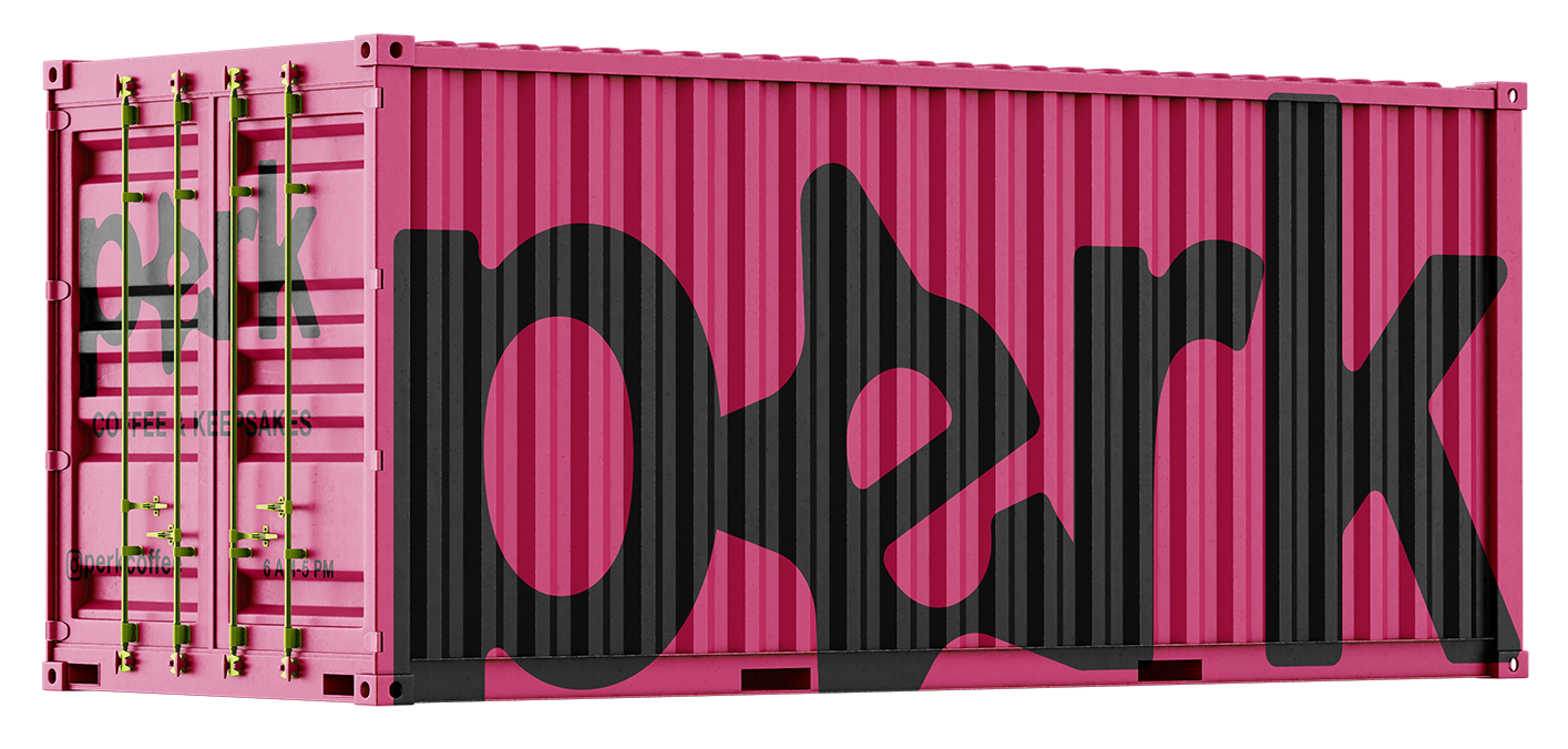
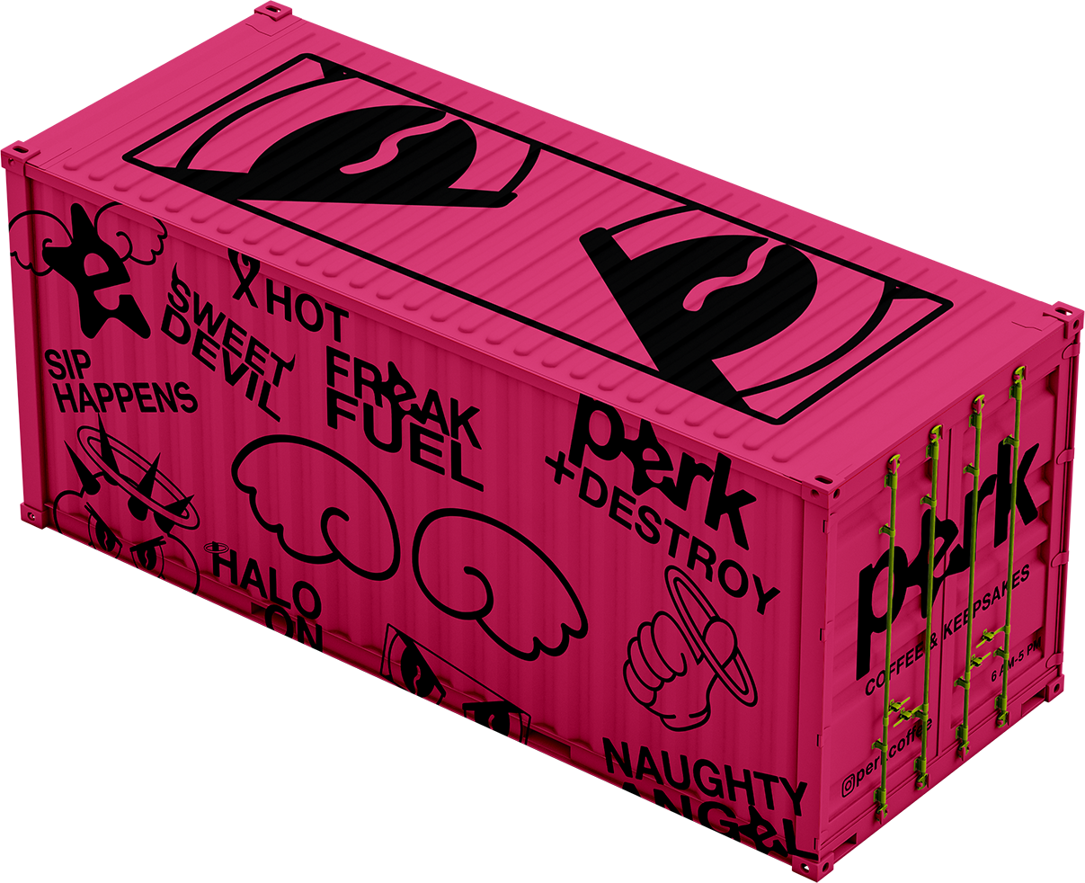
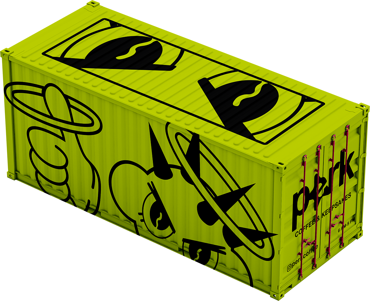
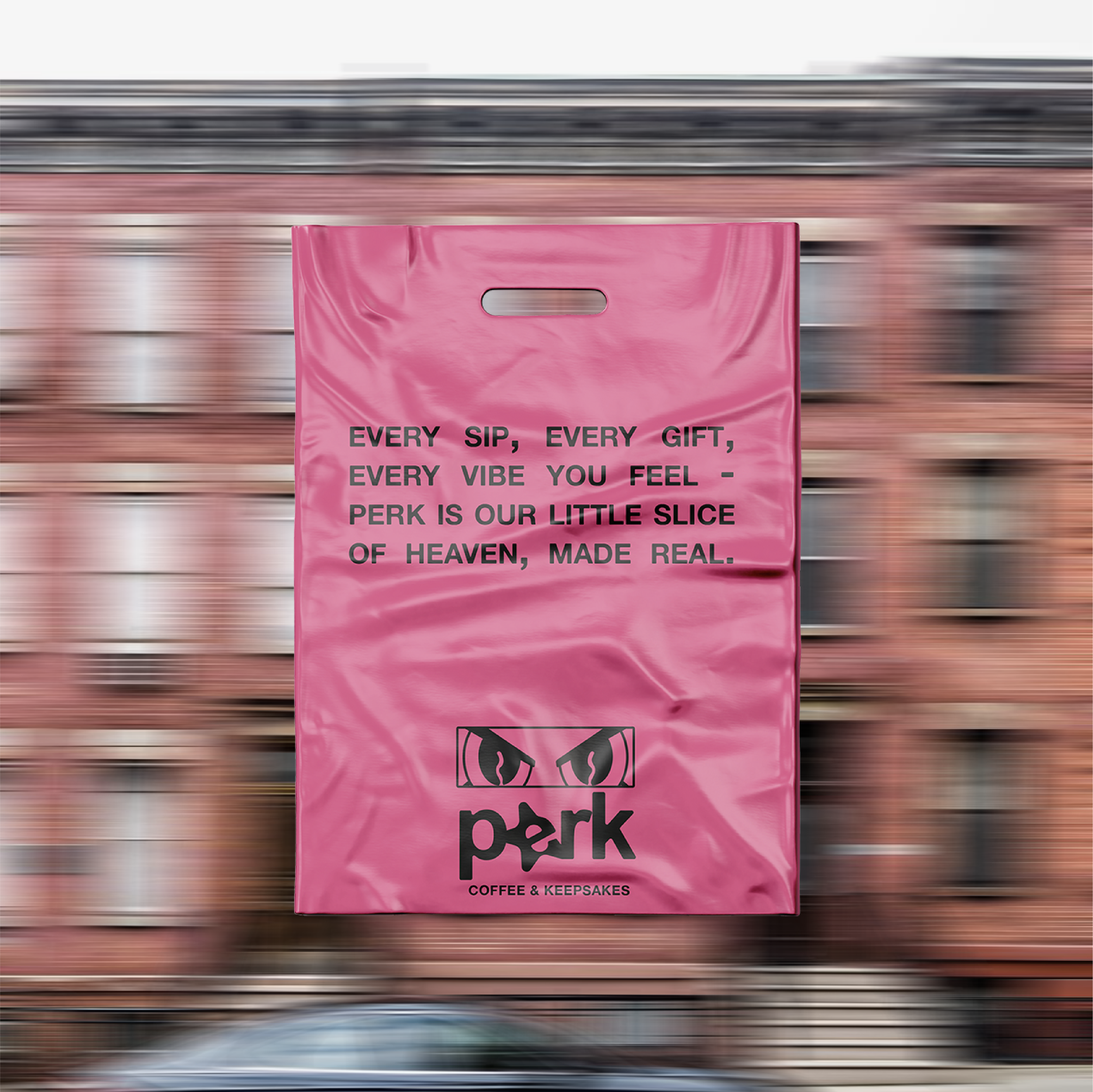
Perk Coffee & Keepsakes is a coffee shop/collectible store in Manhattan’s Lower East Side. Their mission is to bring multiple communities of subcultures together over a cup of coffee - creating a third space for those with niche interests. Perk believes in authenticity, individualism, and community. With a unique coffee assortment and niche hard-to-find ephemera, Perk has something for everyone.
→ BRANDING → CREATIVE DIRECTION → SOCIAL MEDIA → TYPOGRAPHY → COPYWRITING → MENU DESIGN → PACKAGING DESIGN → ILLUSTRATION
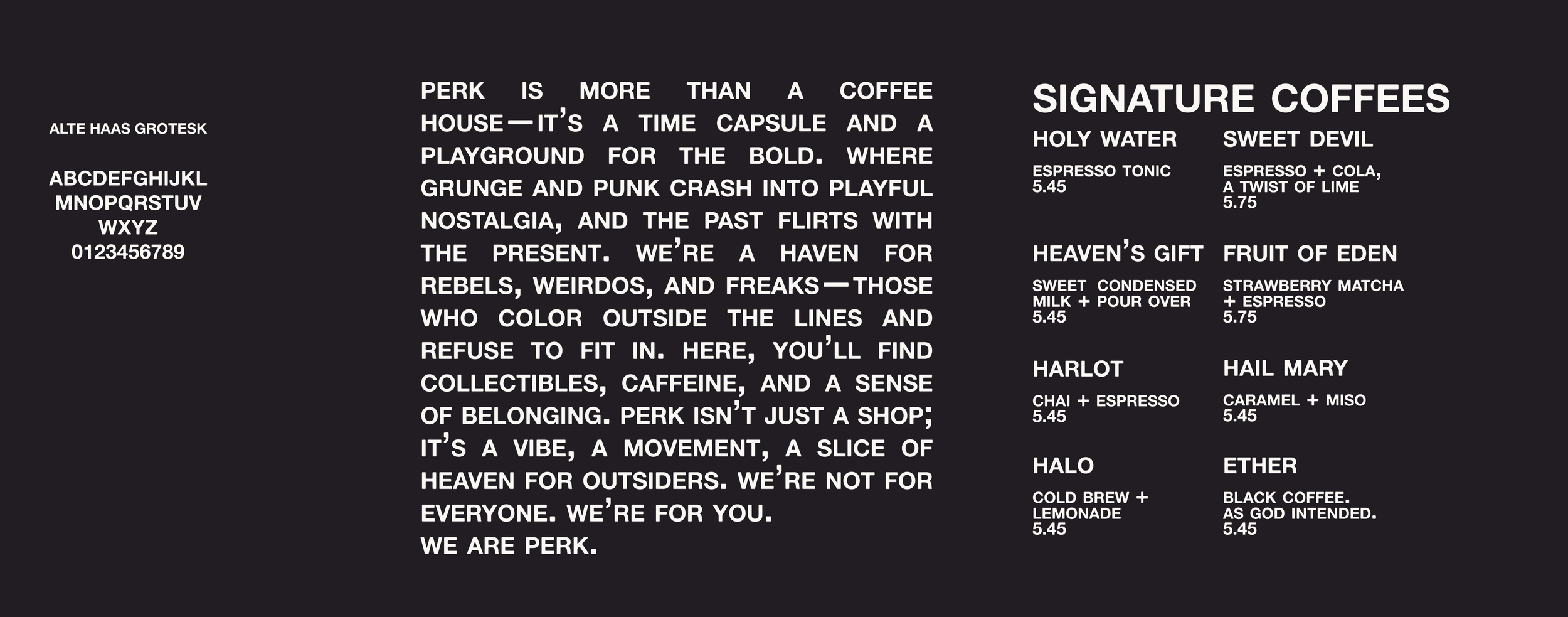
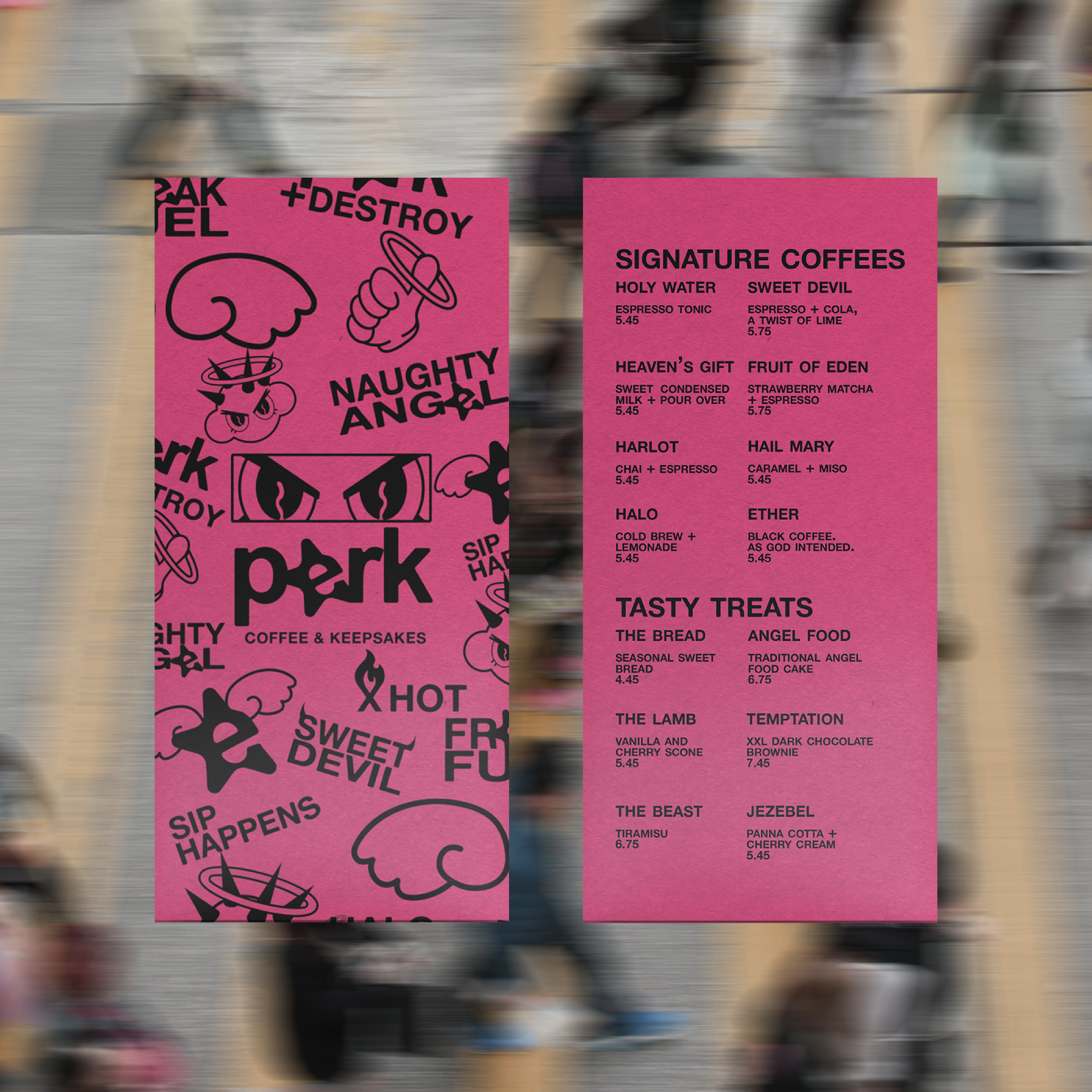
Alte Haas Grotesk was used for it’s legible and familiar look. The typeface includes extremely small divots and bumps on the characters, bringing a natural element to the Helvetica-esque typeface. All caps and full justified type bring elements of punk and assertiveness to the brand.
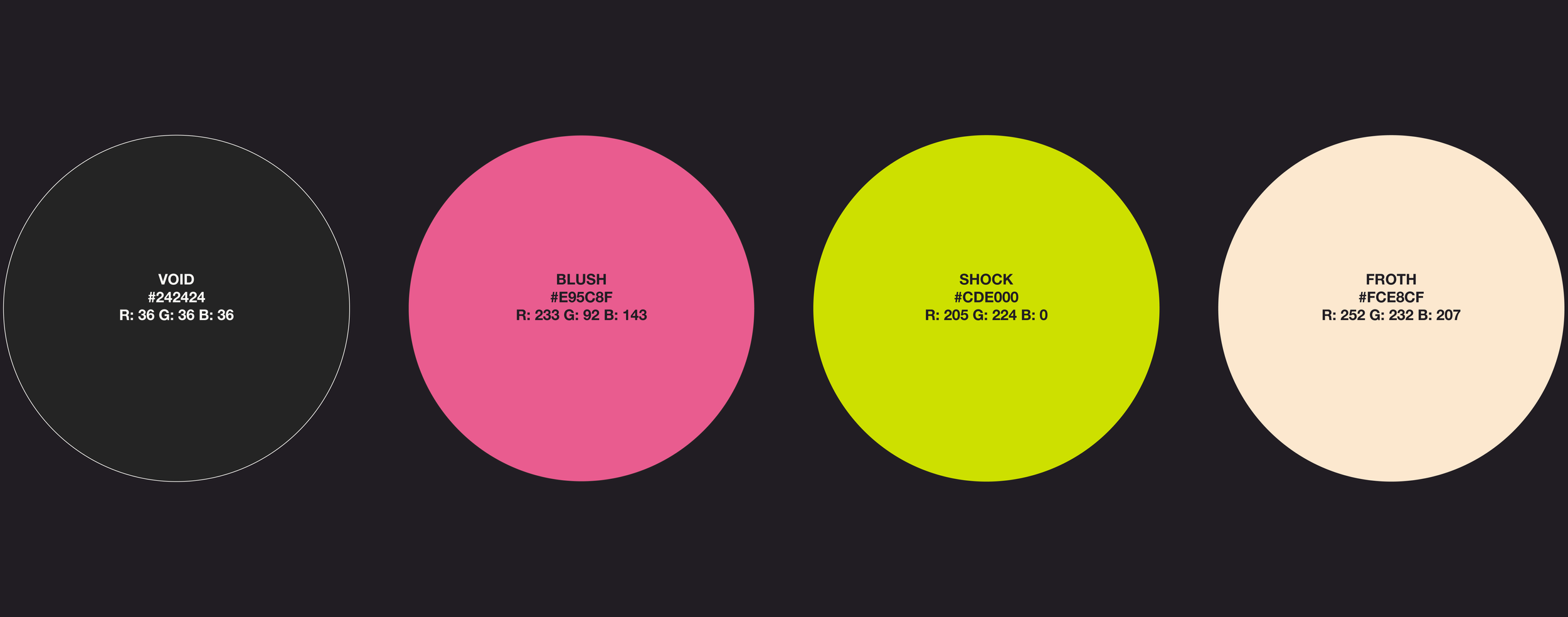
Perk’s color story is reminiscent of 90s punk music scene and the soft palette of popular animes of the period, creating a mix of edge and nostalgia for the brand.
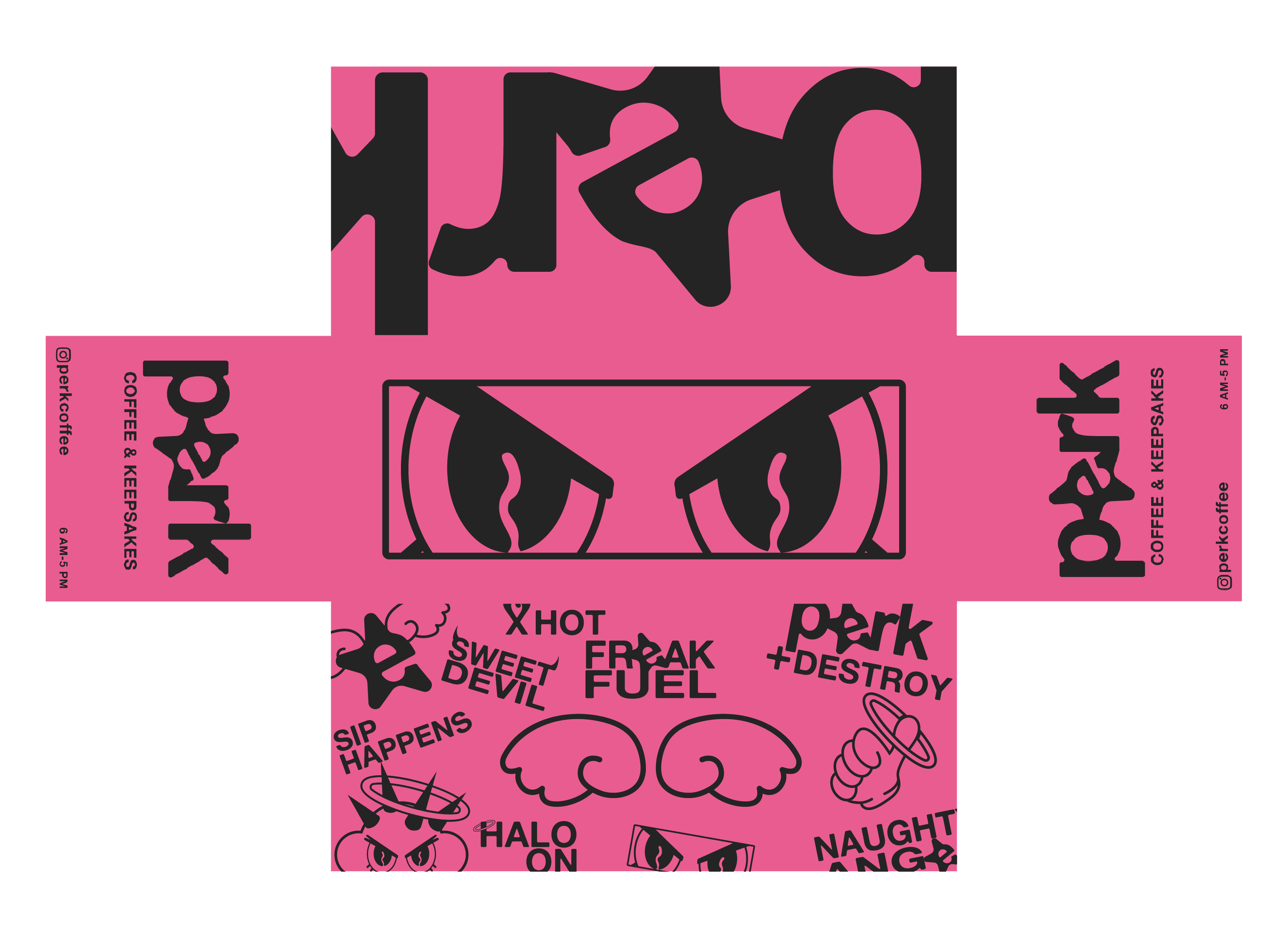
The logo and art style are meant to feel rudimentary, while also referencing niche brands of the early aughts and late 90s, such as Hysteric Glamour, X-Girl, and more. “Kawaii-esque” elements were fused with the punk type treatments, offering tough-meets-cute branding experience that is appropriate for a wide range of demographics.
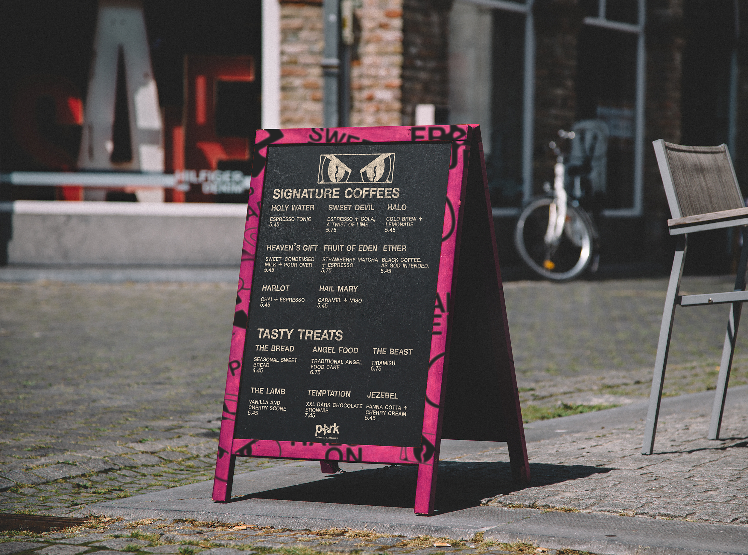
Menu design for Perk is a mix of chaotic, graffiti-inspired art and graphics mixed with a clean and modern type treatment, finding a sweet spot between eccentric punk and digestible.
Stamp cards for returning customers are based on 9 visits, to represent the 9 rings of Heaven. The thumbs up graphic is drawn in a familiar skater style, calling back to the subcultures that inspire perk.


